Kaps
Client
Practice
Typology
Branding and Packaging Design
a brand for all the
girlies
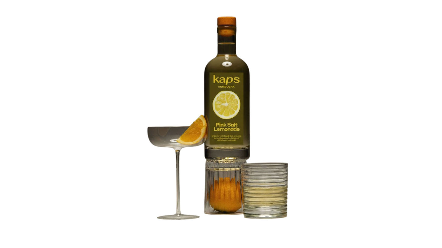
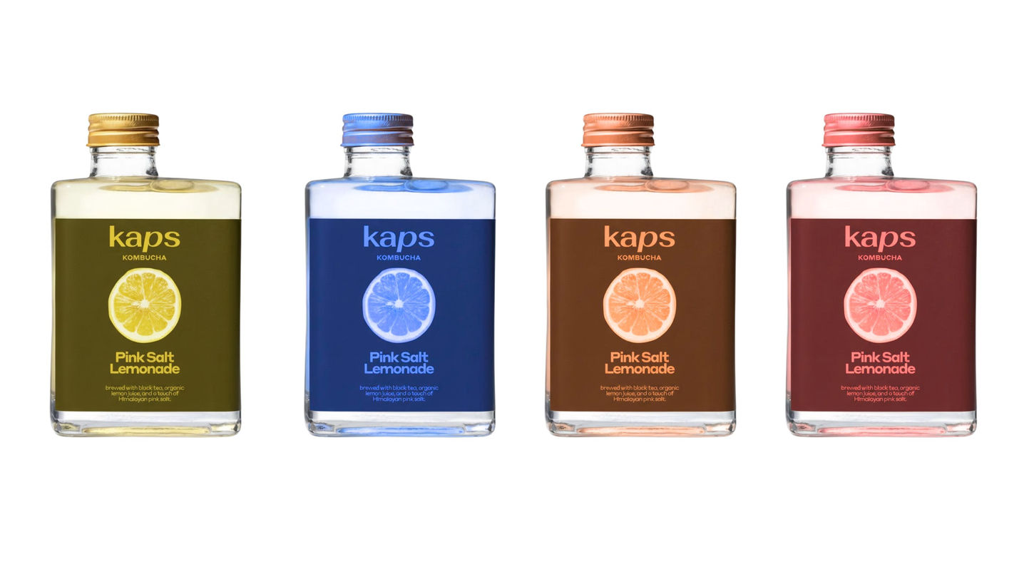
Kaps defines its brand through a marriage of sensory experiences rooted in the California coast: a beverage line and an apparel collection, both united by a distinct matte, dusky color palette. This aesthetic rejects loud, saturated tones for sophisticated, sun-faded hues like terracotta, sage, and soft beige, speaking directly to the discerning "girlie" seeking understated cool. The beverage offers a premium, perhaps lightly flavored or functional, refreshment that aligns visually with the clothing—think packaging that looks like a smooth, sea-worn stone. This consistency creates an instantly recognizable lifestyle mood that is effortlessly chic and deeply connected to coastal living.
While the primary market is B2B, MARINARA also services the B2C market with a luxury segment, allowing home cooks to experience the exact quality their favorite pizzerias might be using. This dual approach is key: the B2C offering acts as a powerful marketing tool, showcasing the product's superior taste and reinforcing the "handmade" narrative. In both channels, the premium cost reflects meticulous sourcing and the artisanal preparation methods, ensuring that whether a customer is a restaurant owner or a home chef, they are investing in the highest standard of dip and sauce.


