BESO
Author
Kanishka Kapoor
Typology
Branding and label design
Achieve strong shelf presence in modern retail
The lip care aisle is overcrowded with products that either feel overly clinical or rely on generic “cute” aesthetics, making it difficult for new brands to stand out. Many lip tints look interchangeable on shelf, lack a strong voice, and fail to emotionally connect with a younger, expressive audience that values both performance and personality. As a result, discovery is low, memorability is weak, and brand loyalty is hard to build.
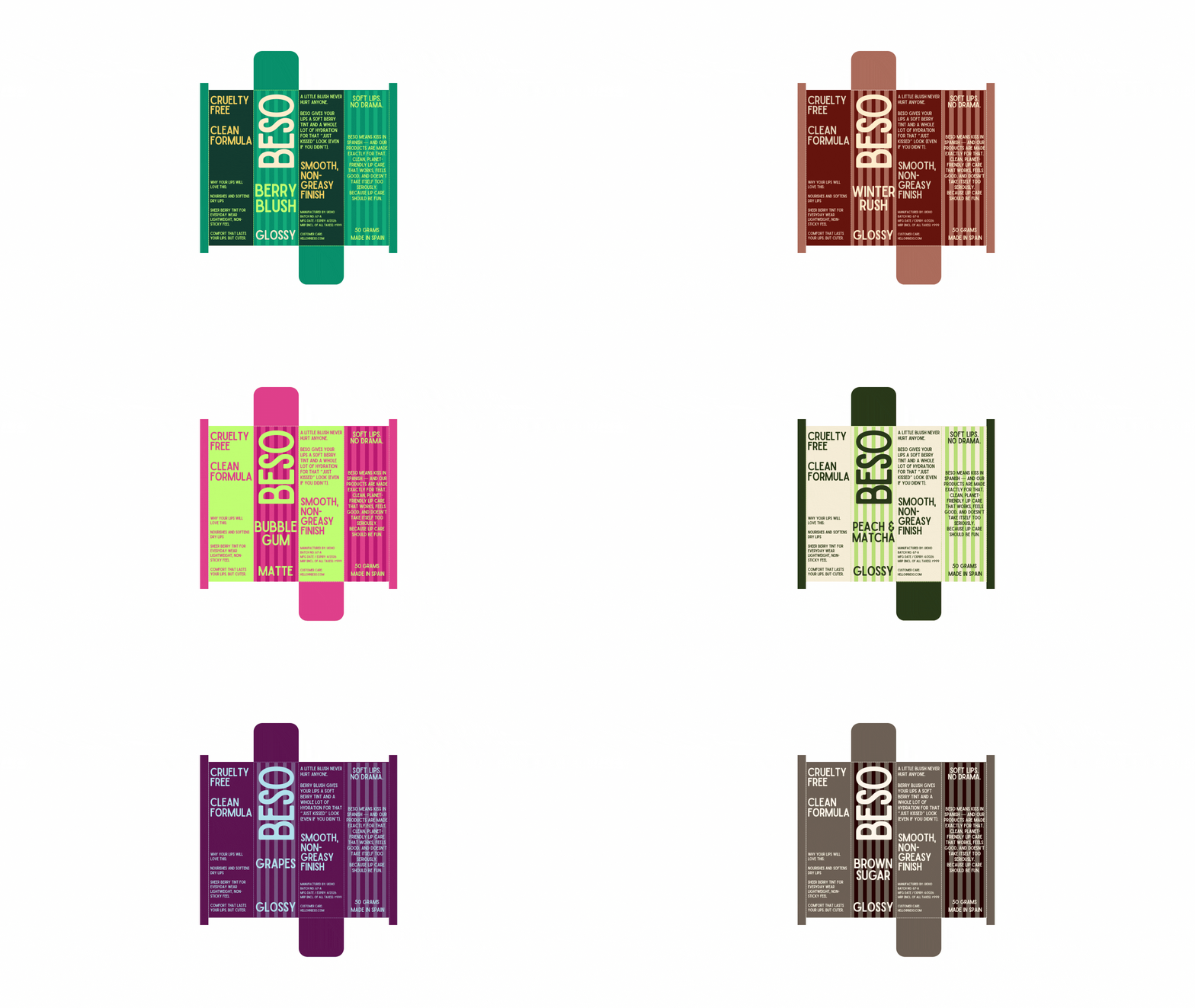
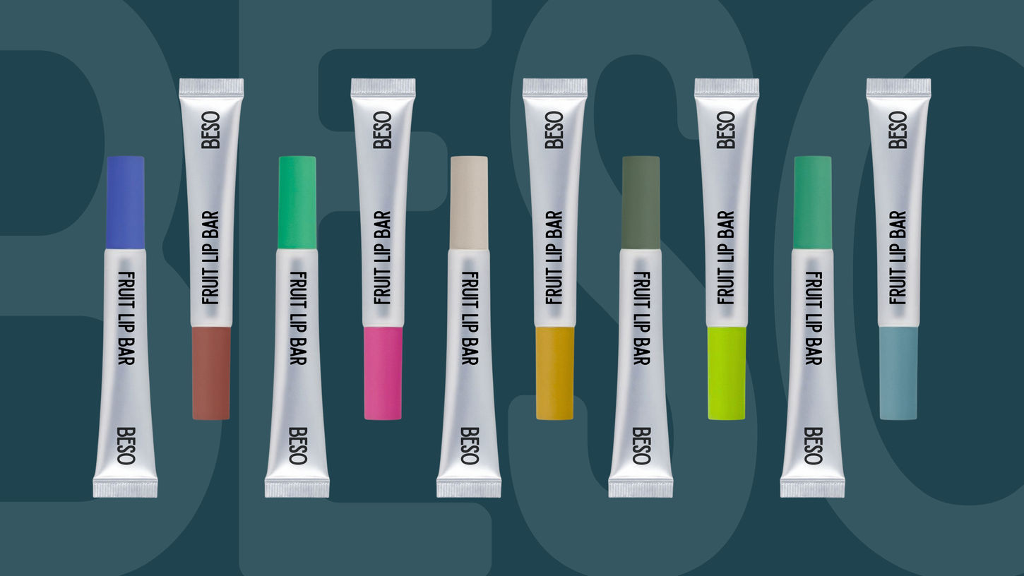
BESO’s packaging system was designed to cut through visual noise with confident colour, bold typography, and playful language that instantly communicates attitude. By pairing a consistent graphic structure with expressive flavour names and punchy copy, the design creates high recall and strong shelf presence while remaining clear and premium. The result is a distinctive, scalable identity that makes lip care feel fun, relatable, and self-assured — turning a functional product into a bold personal statement.


